( Return to Base Color and Initial Shading )

Advanced Shading and Highlighting

This is the point where the piece starts taking on a more 3D appearance, but it means losing control over all those layers you've made previously. If you like what you've got so far, I highly recommend taking a moment to save (which you should be doing frequently anyway) and then save again, this time under a different filename. If you're working with "PrinnyGod.psd", save a new one as "PrinnyGod2.psd" or something similar. This way you have a backup that you can start over with if you massively screw up. Trust me, the one image you really want to be able to go back on you're going to forget to do this.

Next, turn your background layer invisible in the same way you turned your lineart invisible earlier. Make sure that the background isn't your selected layer, bring down the Layer menu and choose Merge Visible. This will merge all elements of your painting into a single layer except for the background, allowing you to still paint a more complex scene behind the figures. If you have a more complicated picture with multiple figures or scene elements over the characters you can, by selectively making layers visible or invisible, make each character or element a seperate layer.

Though it isn't strictly necessary, I've gone through and used the smudge tool with the same brush I used to shade the hair and with the stylus pressure checked. It smooths out the shadow transition and makes the pencil lines less noticable. The biggest change was to the nose, where I decided that the shading as I had originally laid down didn't work. Using a combination of the smudge tool and a little bit of low opacity airbrush, I changed it to appear more like I imagined it should. Remember - never be a slave to your lines.

A careful hand, a fairly large, soft airbrush set to a medium opacity, and patience are crucial at this step. If you rush through this your painting will look incredibly sloppy. Create all the layers you need to smooth out the skin or fabric. More obviously textured materials, such as hair or wood, are often best done with other methods in order to look realistic. Again, even at this stage make sure you don't loose the sharp shadows that still belong there. Picking the right colors to use in order to smooth out the shading is a bit of an art it itself. I recommend that you start with something almost exactly at the mid point between your ajoining colors. Too dark, and the shadows will start to overtake the painting. Too light, and it will appear washed out. It's very easy at this point to call the skin complete, but I have several techniques I use to make it fit my style more.

Now it's time to finally start working with some advanced color techniques! Shadows, especially on skin, tend to be cooler in hue than the surrounding areas. To run through the basics right now, blue, green, and purple are considered cool hues, while red, orange, and yellow are warm. What this means for the painting is that I apply a layer of one of the cool hues over the shadowed areas. While it doesn't need to be as exact as your shadowing itself, it does help to zoom in on areas like the face to make sure you're getting it where it needs to be. This is also the time when all the different layers that Photoshop offers become your best friends. As you can see from the picture, I've brought the opacity down to 50% and set the layer to "Multiply". While Multiply is a type I use quite often, I might also choose Overlay, Soft Light, Hard Light, Darken, Hue, or Color - it really depends on what my painting looks like up to this point and what color I've chosen to cool down the shadows with. If you've made your shadows too greyed out back in the first stages, you'll probably find that your shadows are picking up too much of the cool color here and it will look very unnatural. On the other hand, if you know what you're doing with this, you can use it to create some very eye-catching shadows.

Here is another nifty feature of digital painting that I sorely miss every time I work in physical media - the ability to alter the things I've just done without muss or fuss. After setting the type and opacity of the shadow cooling layer I decided that the purple I'd chosen had too much warmth to it. To change it, I bring down the Image and then Adjust menus and choose Hue/Saturation. By dragging around the Hue and Saturation, you can see how different colors affect your shadows. I changed the purple to a greenish-blue and was much more satisfied with that.

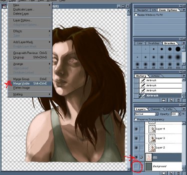
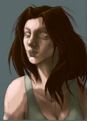
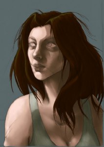
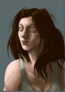
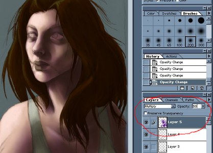
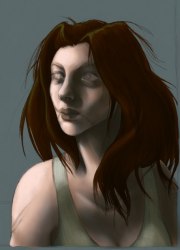
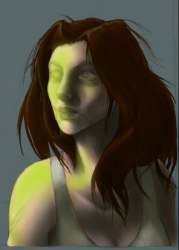
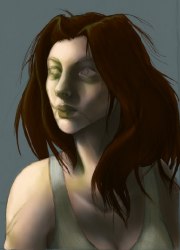
The same basic theories hold true for highlights as for shadows, except in reverse. Most highlights are warmer in hue than unshaded or shaded skin, so one would add red, orange, or yellow on a layer above the skin. For Janet, I've set it to "Soft Light" at 78% opacity, but Screen, Overlay, Hard Light, and Lighten are also good options. What I'm using really is more green than yellow, so it gives the painting a very nice, slightly creepy quality. Just because most highlights are warm and most shadows are cool doesn't mean that you always have to follow this formula. Take into account the color of your light source, any colors that would be reflected from the nearby environment, and the overall atmosphere you want in your artwork.

With that completed, I create another layer, again on "Soft Light" but this time at 100% opacity to give some areas of the body and face - especially around the nose, lips and eyes, a warmer hue with a nice, rich red. Unless your subject is a member of the undead and you're going for that look, giving the face a bit of warmth will make it seem more alive.

Before continuing, I recommend merging the layers, again taking care to avoid including the background. If you like, now would also be a good time to save another copy.

(( Continue to Detailing and Final Variations ))

All images are © 2003 to Julia Lichty. Do not use or distribute these pictures without permission.
« backemail