( Return to Advanced Shading and Highlighting )

Detailing and Final Variations

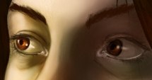
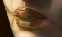
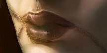
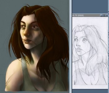
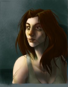
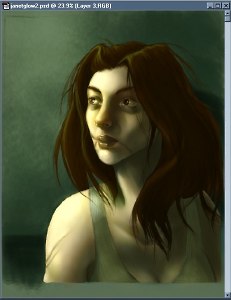
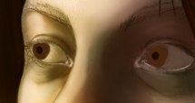
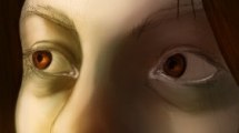
For small details like the eyes and lips, it helps to have a well-shaded base to work on. The first thing I did here was give some weight and thickness to the edges of the eyelids by adding definition with a light, slightly pinkish color. On a new layer, I give the irises and pupils their basic shapes, then continue to define them with threading highlights in amber and darker brown shadows. In order to blend it in better with the already established shadows, I chose to make the layer "Hard Light". If your painting is lighter, or you find that changing the type of layer isn't doing the trick to get the irises to blend well with your shading, create a new layer and group it with the one you're working on. Using Multiply, Overlay, Hard Light, or whatever else works for the situation, go over the iris that needs to be darker with a color that's similar to the surrounding shadows.

Moving on to a new multiply layer, I added some shadows on the whites of the eyes themselves and darkened the crease of the eyelid above the eye. Then with yet another new layer (detailing at this point results in a large number of layers that should be compressed fairly often), I painted in the eyebrows, eyelashes, and the highlights on the eyes. Depending on the amount of light your character is in, the highlights will be more or less noticable, but if your painting has one eye in distinct shadow such as this one, the highlight on that eye should have much less contrast than the one directly in the light.

Giving more definition to the lips is as simple or as complex as you want it to be. Emphasizing the shading and highlighting with thin, vertical strokes of color gives them more of the texture of normal lips. Young children and men or women wearing lipstick will tend to have more definite highlights here. Mo matter what, the lips will be a different color than the surrounding facial skin but the amount of the difference varies between races and individuals. I've also added some pink color to Janet's scars and then put a "Soft Light" layer on top to add a bit more red to the lips and blue under her eyes.

Final detailing involves things like strands of hair that tend to cover many elements of a drawing and do exactly as they please. To give myself a better framework for the loose hair details, I opened the original pencil drawing. This is a cleanup stage as well for figures - making sure that the clothing has sufficient detailing, the hair highlights are still holding enough contrast, and any small or unusual elements aren't overlooked. If you have multiple figures, you get to repeat this whole process for each one.

With your figure or figures and any foreground objects completed, it's time to add in a background. Like many things, this can be as complicated or as simple as you have the desire and talent to accomplish. If you have a very complex background, it might be helpful to block it out in basic colors at the same time you do the figures, but that's yet another thing for another tutorial. First, do a final layer merge leaving only two - one with the background and one with everything else. Between the background and the "everything" layer, create as many as you need to paint the background of your choice. Here, I used three layers of shading and two of highlighting. The brushes I used were custom-made to cover large areas in little time, and also leave rich textures. Don't forget any shadows the figures or foreground elements will cast on your background. If there are areas where anything in the foreground is jagged or doesn't mix well with the background, create a new layer on top of the "everything" layer and use a small airbrush paint over the flaw.

At the very end comes one of my favorite steps of all - color unification. This time, you can start out with bringing down the Layer menu and choosing Flatten Image. That will reduce your painting to a single layer. The painting as it was at the end of the previous step would be perfectly fine if you like normal, natural lighting. I tend to prefer unnatural lighting, which makes this particularly fun. On the layers palette, you can see the painting in the background plus the three additional layers I've used to make the effect. On the first, I've used the Paint Bucket tool to flood the entire thing with a nice green and set the layer to 25% "Color". As with other steps, you have the choice to use other types of layers such as Overlay, Soft Light, Hard Light, and Hue. The higher the opacity of this layer, the more unified your colors will be. For more normal lighting, keep the opacity around 5%. For very colored lighting, you might go as high as 35 or even 40%. The second is a glow layer of a slightly green-tinted yellow set at 16% "Dodge". (Just a note - most people will say to never use dodge on skin. It's very easy for a beginner to think that using the dodge and burn tools to shade skin is a good idea when in fact it's about the worst thing you can possibly do, but used subtly as a layer, dodge can produce some beautiful lighting effects.) The third layer is just a small additional highlight to her right eye to make it look more real with the additional lighting.

Finally, to the presentation. Flatten the image again so you have a single layer to work with and crop it down to the finished picture area. Adding a border is a nice touch and is easily accomplished by first choosing a color and setting it as the background in the color chooser. Then go to the Image menu and select Canvas Size. Enlarge it by only a few pixels all around. Choose a different color for the outer border, set it as the background, and enlarge the canvas again - this time by enough that you end up with a nicely sized border. How many pixels this takes will depend on the size of the canvas you're working on to begin with. Save this as a final, full resolution version if you plan to make prints of it or use it for your portfolio. For display on the web, you'll need to resize and compress it. Again go to the Image menu and select Image Size. First of all, bring the resolution down to 72 pixels/inch. If you have a website of your own you might already have a preferred size, or if you plan to submit the picture to an online gallery such as Elfwood or Epilogue you should check to see what their size restrictions are before submitting. In most cases, I wouldn't recommend going over 750 pixels high or wide without good reason. If there is a part of the image that you're particularly keen on showing off, it's more polite to include details seperately than make the image huge. There are a couple different file formats that are standard on the web - .gif, .jpg or .jpeg, and increasingly .png. There are good and bad aspects to all three formats. Only save a picture as a .gif if it is small and has few colors, otherwise it will completely butcher your work. JPGs are probably the most widely used format for online artwork, and depending on the level of compression you choose can run the range from maiming your art just as badly as a GIF to taking an eternity to download on a regular dialup connection. I usually choose a level between 8 and 10 in Photoshop, with a Standard Format. I only occasionally use PNGs, despite their being better in appearance than JPGs. If a picture is full of heavily saturated color - especially oranges or reds, even the highest quality JPGs will "bleed". PNGs eliminate this problem, but at the cost of having much larger file sizes that take longer for people to download and suck up bandwidth faster.

And there you have it - the end.

(( Return the Menu ))

All images are © 2003 to Julia Lichty. Do not use or distribute these pictures without permission.
« backemail