

This is an older tutorial, completed in 2003, and using Photoshop 5.5, but most of the techniques involved are still useful and applicable for modern versions.
This tutorial guides you through the steps of taking a finished pencil or inked drawing to a full color CG painting. This is made using Photoshop 5.5, so for those of you using earlier or later versions, your shortcuts and methods might need to be adapted. You'll need basic familiarity with Photoshop's layout and tools, but for the most part anything beyond beginner level is explained.
Section One: Preparing the Drawing - From scanning your drawing to cleaning it up and preparing the linework for coloring.
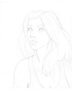
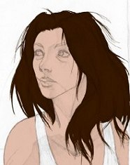
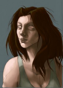
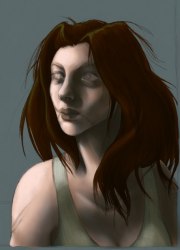
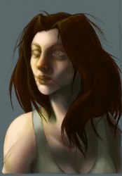
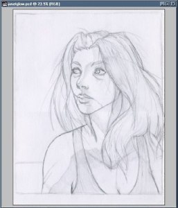 | To start out with, you need a drawing. If you aren't to this point yet, you probably are looking for a different tutorial. For this example, I'm using Jess's "Janet". Sometimes I start out with a much less defined sketch, or do a drawing digitally (usually starting out in Painter 7 and moving into Photoshop), but this is still my most typical way of working. You can see how "dirty" it is - I do work on white paper, but my scanner is small and cheap, so white paper typically looks pretty grey when it is first scanned in, and because I work large (normally 11 x 14 inches), I have to scan it in two passes and piece them together. I typically scan at 200 dpi if I'm going to be working on a printable colored piece then enlarge the lineart to 300 dpi because my scanner hangs if I try to scan anything over 200 dpi, and my computer hates me working on full sized 300 dpi pictures enough as it is, though if your computer can handle it, 600 dpi is a better print standard. Two important things to note: one, while I'm working I save things in an RGB color .psd format. Depending on the number of layers involved and the size of the finished picture, the file sizes can get quite large (up to and over 100 MB a piece). Make sure you have the hard drive space if you're going to be doing a lot of these. Two, in this particular case I've made it a point to include a general guideline for light and shadow. This isn't present in most of my drawings, but it makes it easier to point things out here and can help you if you're having a difficult time deciding where to start shading once you take a drawing from the paper to the pixel. |
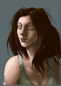
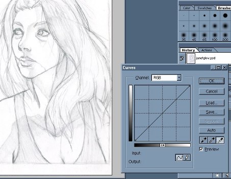 | There are several methods of cleaning up a dirty drawing. Bring down the and then menus. You can try Levels or Brightness/Contrast, but for the most part I prefer to use Curves. You can either click and drag portions of the line running diagnolly across the grid to make brights brighter or darks darker, or you can use the eyedroppers to define white, black, and grey points. For this picture, I found that using only the white eyedropper was sufficient, as I didn't want the lines to be too heavy. Simply click on an area that should be white with the white eyedropper. To set the black one, you would click on the darkest part of your drawing. Depending on your drawing style, how much you adjust the lines at this point can make a big difference in the finished piece - whether you leave them light and low-contrast for a more painterly piece, or start with an inked drawing for very precise illustrative-type work. |
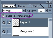
 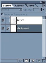 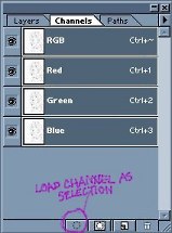 | In order to start the actual coloring process, we need to be able to color under the lines of the drawing itself. To do that, first select the entire canvas and copy it to a new layer. Then, select the entire background layer and push delete. This should clear out the background layer, leaving it pure white if you're on photoshop's defaults. You can have the background be any color you like, but in this case I'm starting out with white because it enables me to fill in some fine details that I wouldn't be able to see otherwise. Once you're finished with that, reselect layer one and move over to "Channels". Here, move down to the small dotted circle button. That's "Load Channel as Selection". Press it and you should see all of the white areas of the drawing selected. Press Delete. |
  |  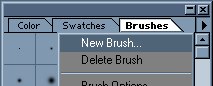 |
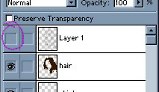
| Your drawing looks quite a bit different now, doesn't it? Don't worry. From "Layers", check the box to Preserve Transparency, then go over the entire drawing with a large brush at 100% opacity. At this point, black is the only thing you'll need. Because I work very large, you might find that the default photoshop brushes aren't large enough cover things quickly. In this case, it's easy to simply define a new, larger brush from the brush menu. (Something I might cover more in-depth in another tutorial.) |
Section Two: Base Color and Initial Shading - Laying down solid areas of color and the first layers of shadows and highlights.
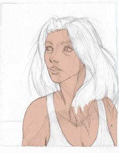  | Create a new layer between the background and your lineart layer. I usually prefer to start with the skin, but technically you could start with anything you wanted. There's no need to be precise at this point. Even though I work with a Wacom, for right now I turn off the pressure sensitivity and color in the areas of the drawing that would be part of the skin with a hard-edged airbrush set at 100% opacity. Don't worry about areas like the eyes and eyebrows - those will be covered later in the tutorial. If you're worried about small details, especially around hair or jewelry, err on the side of covering too much rather than too little. It's easy to go back in and erase if you need to, and other layers will cover areas of the skin anyway. |
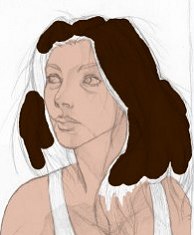   | Repeat the process, creating a new layer for the hair. Because hair is often full of tiny details, it can help to first block out the biggest areas with a large brush, then zoom in to 100% or even 200% to use progressively smaller brushes to fill it in. The more detail you get at this point, the easier later steps will be, so don't try to rush through. |
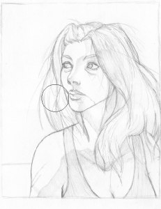
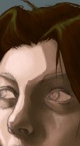
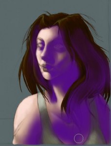
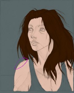 | Finished with the dark layers that required a high contrast to see all the necessary details, I use the Paint Bucket tool to fill in the background with a nice, blue-greenish grey. Having a background color helps to reduce eye strain and makes shading and highlighting easier because you can see the colors better without the glare of pure white. I almost always pick a cooler grey, but sometimes beige or a lighter, but higher saturation pastel makes a good choice. It really depends on the mood and content of your picture. Circled in purple you can see an area where it becomes obvious that the flesh color extends beyond the lines that wasn't so obvious when the background was white. Zoom in to any flaws like these you see and clean them up. Now that you have a darker background to work on, you can continue with any layers that need to be lighter, such as the shirt in this case. Depending on how complicated your drawing is, you can have a huge number of layers - skin, hair, different jewelry, coat, shirt, pants, shoes, buckles... There's very little limitation. I would recommend a new layer for any distinct area, and especially for details that you'll have to zoom in to considerably to fill accurately. |
 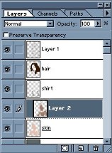 | Create a new layer above your skin layer, then bring down the menu and select Group with Previous. Usually I use the shortcut for this, which is Ctrl + G. Here is where having a well filled in area benefits you the most. Grouping this layer with the one under it means that anything you paint on this one will only extend as far as pixels are filled on the skin layer. This makes shading a lot easier and more precise. In essence, you can't color outside your own lines now. You may find that as you apply shading here that you've missed some of the skin underneath. If this happens, simply reselect the base skin color, move down to the original skin layer, fill in the flaw, and then move back up to the shade layer to continue on with that. At this point I am still using a hard-edged airbrush at 100% opacity with pressure sensitivity turned off. If you already have lines for shading on your drawing, apply the shading as planned. If not, you'll need to pick a light source and shade accordingly. I've chosen a source slightly above and to the left. For the shadows themselves, I picked a darker version of the skin color. It's important to note that the shadows are darker, but not greyed out! If you make your shadow colors too grey at this point, later parts of the tutorial will not work as well as they should. |
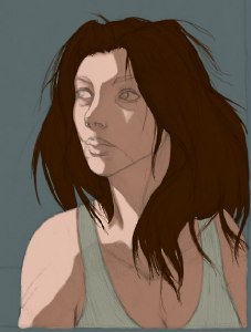
 | 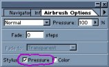  | Using the same method of creating new layers and grouping them with the previous ones, I've added two additional layers of shading in progressively darker tones and one layer of highlighting. Because subtlety is starting to become a factor, I've checked off the "Pressure" option for the stylus on the Airbrush menu, but I'm still using it at 100% opacity. My colored pieces tend to include heavy shadow, so if you're going for a similar effect don't be afraid to really emphasize the darkness where it needs to be. Also, even at this stage make sure that where there need to be well defined shadows, such as around the nose, that you keep them clean. The human face has an incredible variety of curves to it that will be different for each figure. I can only recommend a combination of life drawing, closely studying anyone who will sit still long enough for you to look at them longer than anyone is comfortable with, and keeping a large folder (physical or digital) full of facial references in all types of lighting situations. Guys, or anyone else who has problems drawing breasts, remember that very few women will form natural cleavage that's just a line without an Iron-Grip® bra. Put some shading between them, please. |
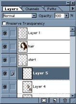
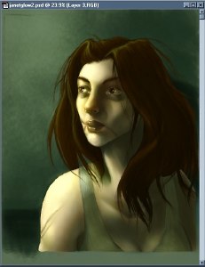
  |  | With the skin well established, it is a good time to use a few tricks to check the progress of your painting. The first one is to make the lineart invisible. To do that, simply click on the little eye next to the layer it's on. When you want it back, click on the empty space again and it should reappear. In my normal style, I count on the lineart more as a guideline for shadow and light than something that should be a major element in the finished piece, so even with that layer made invisible, the shading and highlighting should make for a very solid piece. If it doesn't, something needs to be changed. Depending on your style, this step may be of more or less use to you. The second trick is to flip the canvas horizontally. This is accomplished by bringing down the menu, then and selecting Flip Horizontal. This one is especially useful if you're working with an all digital image. It forces you to look at your painting in a whole new light - checking for balance and proprotional inconsistencies. During the course of a normal painting, I'll flip the canvas several times, but for this one I only did it once due to its simplicity and the fact that I'd checked the drawing on a mini light desk before I scanned it in. If you find that there are things that need to be changed, you can work on them in this horizontally flipped state until they look right. Occasionally you might find that a drawing or painting looks better when it's flipped. If that happens, it's really up to you whether you want to keep it that way. Some people might be overjoyed, but others might consider it "cheating". As for myself, I have no problem with it - it's just another tool at your disposal. Return the painting to its normal direction and continue on with other layers once you're finished correcting it. |
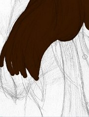
   | The methods I use for dealing with dark and light hair vary considerably. The lighter the hair, the more complicated it tends to be. Sometimes I'll use twenty or more layers alone on light blonde hair to get it to the point where I'm finally satisfied. Darker brown and black hair I don't fuss over nearly as much, but because they are so dark it can cause problems working on them. No matter how dark hair is, it will have shadows that are darker still. Black hair will shade either from a brown-black or a blue-black when I first block it in. To get good visibility of the hair details from your drawing when working with a darker shade, first make a new layer and group it, then use the Paint Bucket tool to flood it with a lighter color. Now you can actually see what you're working on. Pick your shade color for the hair and paint in where it needs to be on a new layer. For this step, I've chosen a different brush comprised of many small specks and lowered the opacity to 45%. Just like the skin, you can use as many layers of shading as you like. After you're finished with the shading, delete the layer you flooded with the lighter color in the first step and create another one on top to add your highlights. For most characters I would add quite a bit more highlighting than this, but Janet's is very dark and has that subtle "fresh from the psych ward" sheen. |
Section Three: Advanced Shading and Highlighting - Taking the painting from humble beginnings to a more realistic appearance - including adding color to your shadows and bringing life to a character.
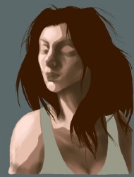
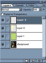
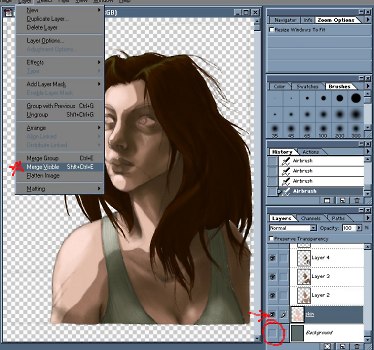 | This is the point where the piece starts taking on a more 3D appearance, but it means losing control over all those layers you've made previously. If you like what you've got so far, I highly recommend taking a moment to save (which you should be doing frequently anyway) and then save again, this time under a different filename. If you're working with "PrinnyGod.psd", save a new one as "PrinnyGod2.psd" or something similar. This way you have a backup that you can start over with if you massively screw up. Trust me, the one image you really want to be able to go back on you're going to forget to do this. Next, turn your background layer invisible in the same way you turned your lineart invisible earlier. Make sure that the background isn't your selected layer, bring down the menu and choose Merge Visible. This will merge all elements of your painting into a single layer except for the background, allowing you to still paint a more complex scene behind the figures. If you have a more complicated picture with multiple figures or scene elements over the characters you can, by selectively making layers visible or invisible, make each character or element a seperate layer. |
  | Though it isn't strictly necessary, I've gone through and used the smudge tool with the same brush I used to shade the hair and with the stylus pressure checked. It smooths out the shadow transition and makes the pencil lines less noticable. The biggest change was to the nose, where I decided that the shading as I had originally laid down didn't work. Using a combination of the smudge tool and a little bit of low opacity airbrush, I changed it to appear more like I imagined it should. Remember - never be a slave to your lines. |
  | A careful hand, a fairly large, soft airbrush set to a medium opacity, and patience are crucial at this step. If you rush through this your painting will look incredibly sloppy. Create all the layers you need to smooth out the skin or fabric. More obviously textured materials, such as hair or wood, are often best done with other methods in order to look realistic. Again, even at this stage make sure you don't loose the sharp shadows that still belong there. Picking the right colors to use in order to smooth out the shading is a bit of an art it itself. I recommend that you start with something almost exactly at the mid point between your ajoining colors. Too dark, and the shadows will start to overtake the painting. Too light, and it will appear washed out. It's very easy at this point to call the skin complete, but I have several techniques I use to make it fit my style more. |
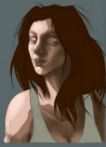
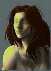
 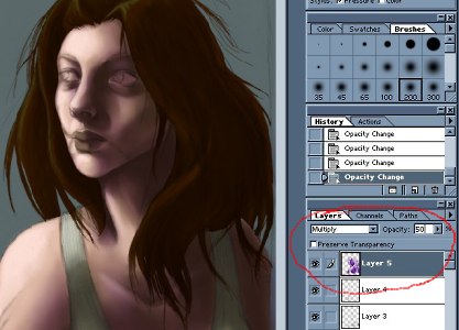 | Now it's time to finally start working with some advanced color techniques! Shadows, especially on skin, tend to be cooler in hue than the surrounding areas. To run through the basics right now, blue, green, and purple are considered cool hues, while red, orange, and yellow are warm. What this means for the painting is that I apply a layer of one of the cool hues over the shadowed areas. While it doesn't need to be as exact as your shadowing itself, it does help to zoom in on areas like the face to make sure you're getting it where it needs to be. This is also the time when all the different layers that Photoshop offers become your best friends. As you can see from the picture, I've brought the opacity down to 50% and set the layer to "Multiply". While Multiply is a type I use quite often, I might also choose Overlay, Soft Light, Hard Light, Darken, Hue, or Color - it really depends on what my painting looks like up to this point and what color I've chosen to cool down the shadows with. If you've made your shadows too greyed out back in the first stages, you'll probably find that your shadows are picking up too much of the cool color here and it will look very unnatural. On the other hand, if you know what you're doing with this, you can use it to create some very eye-catching shadows. |
 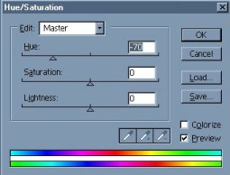 | Here is another nifty feature of digital painting that I sorely miss every time I work in physical media - the ability to alter the things I've just done without muss or fuss. After setting the type and opacity of the shadow cooling layer I decided that the purple I'd chosen had too much warmth to it. To change it, I bring down the and then menus and choose Hue/Saturation. By dragging around the Hue and Saturation, you can see how different colors affect your shadows. I changed the purple to a greenish-blue and was much more satisfied with that. |
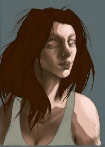
 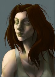  | The same basic theories hold true for highlights as for shadows, except in reverse. Most highlights are warmer in hue than unshaded or shaded skin, so one would add red, orange, or yellow on a layer above the skin. For Janet, I've set it to "Soft Light" at 78% opacity, but Screen, Overlay, Hard Light, and Lighten are also good options. What I'm using really is more green than yellow, so it gives the painting a very nice, slightly creepy quality. Just because most highlights are warm and most shadows are cool doesn't mean that you always have to follow this formula. Take into account the color of your light source, any colors that would be reflected from the nearby environment, and the overall atmosphere you want in your artwork. With that completed, I create another layer, again on "Soft Light" but this time at 100% opacity to give some areas of the body and face - especially around the nose, lips and eyes, a warmer hue with a nice, rich red. Unless your subject is a member of the undead and you're going for that look, giving the face a bit of warmth will make it seem more alive. Before continuing, I recommend merging the layers, again taking care to avoid including the background. If you like, now would also be a good time to save another copy. |
Section Four: Detailing and Final Variations - Eyes, lips, hair, and a completely new take on the painting.
| 
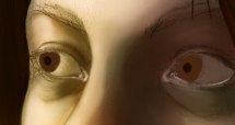
| For small details like the eyes and lips, it helps to have a well-shaded base to work on. The first thing I did here was give some weight and thickness to the edges of the eyelids by adding definition with a light, slightly pinkish color. On a new layer, I give the irises and pupils their basic shapes, then continue to define them with threading highlights in amber and darker brown shadows. In order to blend it in better with the already established shadows, I chose to make the layer "Hard Light". If your painting is lighter, or you find that changing the type of layer isn't doing the trick to get the irises to blend well with your shading, create a new layer and group it with the one you're working on. Using Multiply, Overlay, Hard Light, or whatever else works for the situation, go over the iris that needs to be darker with a color that's similar to the surrounding shadows. Moving on to a new multiply layer, I added some shadows on the whites of the eyes themselves and darkened the crease of the eyelid above the eye. Then with yet another new layer (detailing at this point results in a large number of layers that should be compressed fairly often), I painted in the eyebrows, eyelashes, and the highlights on the eyes. Depending on the amount of light your character is in, the highlights will be more or less noticable, but if your painting has one eye in distinct shadow such as this one, the highlight on that eye should have much less contrast than the one directly in the light. |
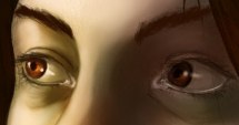
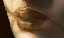 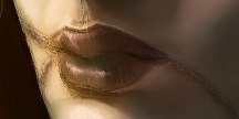 | Giving more definition to the lips is as simple or as complex as you want it to be. Emphasizing the shading and highlighting with thin, vertical strokes of color gives them more of the texture of normal lips. Young children and men or women wearing lipstick will tend to have more definite highlights here. Mo matter what, the lips will be a different color than the surrounding facial skin but the amount of the difference varies between races and individuals. I've also added some pink color to Janet's scars and then put a "Soft Light" layer on top to add a bit more red to the lips and blue under her eyes. |
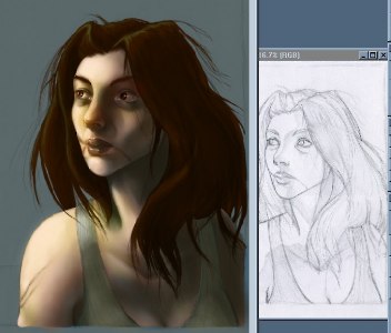 | Final detailing involves things like strands of hair that tend to cover many elements of a drawing and do exactly as they please. To give myself a better framework for the loose hair details, I opened the original pencil drawing. This is a cleanup stage as well for figures - making sure that the clothing has sufficient detailing, the hair highlights are still holding enough contrast, and any small or unusual elements aren't overlooked. If you have multiple figures, you get to repeat this whole process for each one. |
 | With your figure or figures and any foreground objects completed, it's time to add in a background. Like many things, this can be as complicated or as simple as you have the desire and talent to accomplish. If you have a very complex background, it might be helpful to block it out in basic colors at the same time you do the figures, but that's yet another thing for another tutorial. First, do a final layer merge leaving only two - one with the background and one with everything else. Between the background and the "everything" layer, create as many as you need to paint the background of your choice. Here, I used three layers of shading and two of highlighting. The brushes I used were custom-made to cover large areas in little time, and also leave rich textures. Don't forget any shadows the figures or foreground elements will cast on your background. If there are areas where anything in the foreground is jagged or doesn't mix well with the background, create a new layer on top of the "everything" layer and use a small airbrush paint over the flaw. |
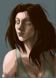
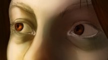
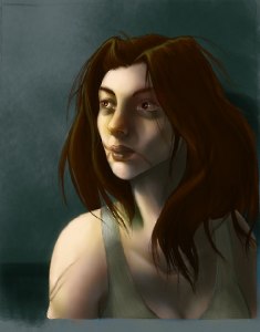
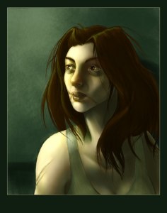
  | At the very end comes one of my favorite steps of all - color unification. This time, you can start out with bringing down the menu and choosing Flatten Image. That will reduce your painting to a single layer. The painting as it was at the end of the previous step would be perfectly fine if you like normal, natural lighting. I tend to prefer unnatural lighting, which makes this particularly fun. On the layers palette, you can see the painting in the background plus the three additional layers I've used to make the effect. On the first, I've used the Paint Bucket tool to flood the entire thing with a nice green and set the layer to 25% "Color". As with other steps, you have the choice to use other types of layers such as Overlay, Soft Light, Hard Light, and Hue. The higher the opacity of this layer, the more unified your colors will be. For more normal lighting, keep the opacity around 5%. For very colored lighting, you might go as high as 35 or even 40%. The second is a glow layer of a slightly green-tinted yellow set at 16% "Dodge". (Just a note - most people will say to never use dodge on skin. It's very easy for a beginner to think that using the dodge and burn tools to shade skin is a good idea when in fact it's about the worst thing you can possibly do, but used subtly as a layer, dodge can produce some beautiful lighting effects.) The third layer is just a small additional highlight to her right eye to make it look more real with the additional lighting. |
 | Finally, to the presentation. Flatten the image again so you have a single layer to work with and crop it down to the finished picture area. Adding a border is a nice touch and is easily accomplished by first choosing a color and setting it as the background in the color chooser. Then go to the menu and select Canvas Size. Enlarge it by only a few pixels all around. Choose a different color for the outer border, set it as the background, and enlarge the canvas again - this time by enough that you end up with a nicely sized border. How many pixels this takes will depend on the size of the canvas you're working on to begin with. Save this as a final, full resolution version if you plan to make prints of it or use it for your portfolio. For display on the web, you'll need to resize and compress it. Again go to the menu and select Image Size. First of all, bring the resolution down to 72 pixels/inch. If you have a website of your own you might already have a preferred size, or if you plan to submit the picture to an online gallery you should check to see what their size restrictions are before submitting. In most cases, I wouldn't recommend going over 750 pixels high or wide without good reason. If there is a part of the image that you're particularly keen on showing off, it's more polite to include details seperately than make the image huge. There are a couple different file formats that are standard on the web - .gif, .jpg or .jpeg, and increasingly .png. There are good and bad aspects to all three formats. Only save a picture as a .gif if it is small and has few colors, otherwise it will completely butcher your work. JPGs are probably the most widely used format for online artwork, and depending on the level of compression you choose can run the range from maiming your art just as badly as a GIF to taking an eternity to download on a regular dialup connection. I usually choose a level between 8 and 10 in Photoshop, with a Standard Format. I only occasionally use PNGs, despite their being better in appearance than JPGs. If a picture is full of heavily saturated color - especially oranges or reds, even the highest quality JPGs will "bleed". PNGs eliminate this problem, but at the cost of having much larger file sizes that take longer for people to download and suck up bandwidth faster. And there you have it - the end. |
I'd like to thank Jess for allowing me to use her "Janet" character for this tutorial.